Whether you are drawing a picture, staging a scene in a play, or taking a photograph, the way you choose to present the elements of your creation to an audience has a huge impact on how they will receive the message you are endeavoring to send.
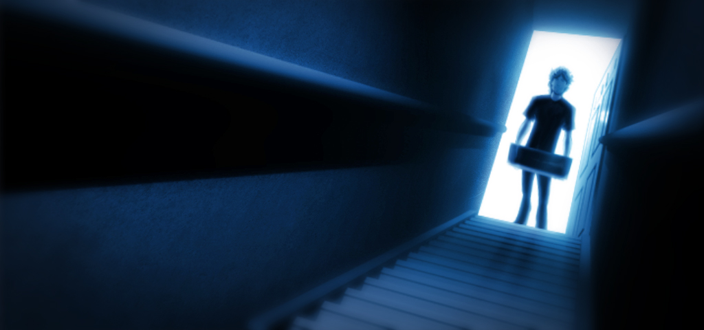
As I was starting to put together storyboard frames for the animatic, one of the first images that formed clearly was this one:
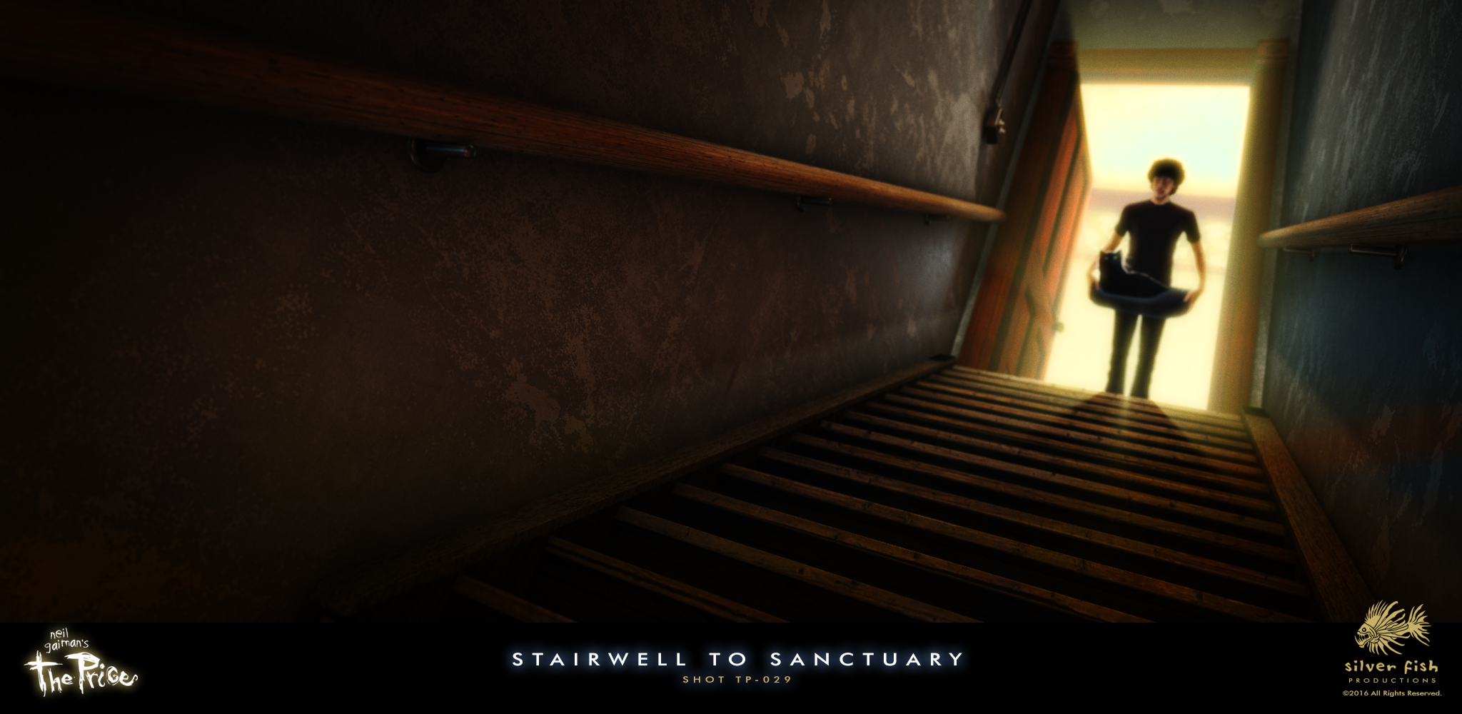
There are times when I struggle to find an interesting way to visualize a scene, but this one leapt fully-formed into my mind. It made me feel everything I was hoping to convey: trepidation, wariness, anxiety and a bit of mystery as well. Although it may just be a basement stairwell, at this point in the story the audience needs to feel like there is definitely something askew with the visit of this seemingly innocuous black cat. I didn’t try to over-think things when putting it together, but the lower, canted angle, strong contrast, and the off-center placement of the doorway at the top of the stairs all combined to create the tone I wanted. It remains one of my favorite shots, so when it came time to build the actual scene, I kept the composition intact.
I hope you are enjoying these images and insights as much as I enjoy sharing them!
Oh, one last thing: is anyone planning on attending the San Diego Comic Con in July? Just asking…


It was a powerful shot in the first incarnation and I’m glad you kept the same tilted angle in the new style.
The little details on the wallpaper and hand rails make it look very realistic.
Thanks Jordi, I appreciate that you notice the details as well. I am trying hard to discipline myself to get the “forms” right in each shot before getting lost in all of those details.
Love the updates, it looks better and better. Will be working at SDCC, hope to see you there.
Thank you Chris — I hope to see you there as well!
Good stuff, as always, Christopher. Thank you for sharing. That is a great shot, and I’m happy to see it intact (with improvements) after its journey from animatic to final scene.
Glad you dig it, Tim (and great to hear from you too)!
Chris, Excellent composition in this. I love the leading lines drawing your attention up the stairs to Neil (ahem)-the leading character. The use of lighting/contrast and the Rule and Thirds is quite strong and impactful here. I think I like the narrower stairwell though. It feels more ominous and threatening. Do love the advanced touches of realism. Thanks for letting us watch the development process.
Chris
Thoughtful observations, Chris, especially the point about the narrower stairs (I’ll keep that in mind). As for sharing the development process, you are quite welcome; I’m just grateful that people like you seem to enjoy it.
I agree with the narrower stairwell conveying more of the unease. The texture in the newer rendering looks amazing. All these recent updates really show such a huge difference in the new tech you’re utilizing. UNNGH this is gonna be AWESOME.
Thanks Trina! I am very appreciative of the constant support, and am thankful you can see the difference!
The rendering is simply astounding!
Thanks Jill, so glad you like it!
Loving this. Your attention to detail makes all the difference.
Thank you Susan; I’m really pleased with how things are (finally) coming together!
That’s a great render. Particularly awesome are the texture of the walls and the stairs, and the image of Neil and the cat are quite affecting.
Thanks Michael! I do agree with a couple of the other comments about keeping the stairs narrow like they were in the animatic — it’s so great to have a way like this to hear about the ideas and observations other Gaiman fans have!