Many of the comments I’ve received in response to these Production Blog posts have included some very positive remarks about the behind-the-scenes details and processes I’ve attempted to convey. With that in mind, I wanted to share the latest computer rendering of the “Narrator” (aka Mr. Neil Gaiman) character from The Price, and breakdown just how it was put together.
As an artistic tool, computers are capable of creating truly astounding imagery; but as with all digital processes, you have to tell your box exactly what to do… and I do mean exactly. It is this aspect of CGI more than any other that causes those of us who attempt it to pull out the largest tufts of hair.
Exasperation. Frustration. Endless complication. In short, there are just a whole lot of “tions” to deal with!
So: the first step is to begin with an incredible digital model (please see Videoblog #04 for a peek at the superb work of Ryan Peterson). Looks fantastic, but now, how do you get the hair to look like, well, hair? And what about the skin?
For help with this highly specialized and technical artistry, I was lucky enough to find the talented (and generous) Michael Hoopes. Currently working hard on the video game Star Wars: The Old Republic for Bioware in the great state of Texas, Michael makes time to develop and test different shaders and to create render passes that he sends on to me to composite (or put together digitally). So, now you’re asking: just what-the-heck are shaders and render passes? Let’s take a look…
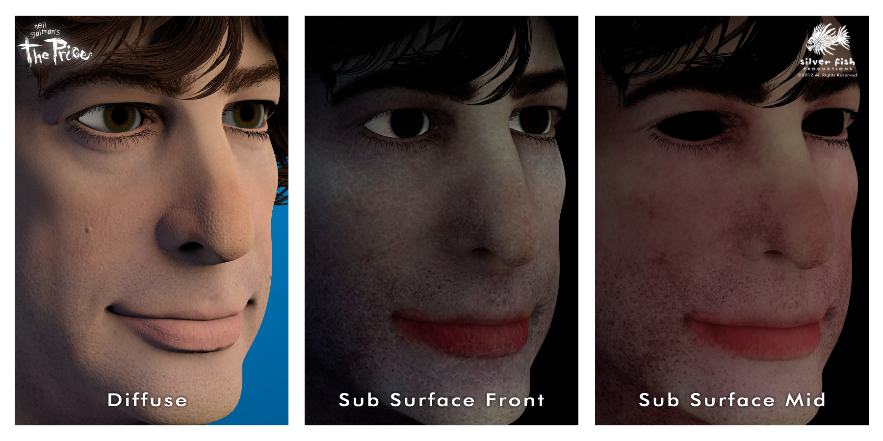
We’ll start with the skin. On the left is a rendered image called a “Diffuse Pass” (pass as in, the computer is going to have to make several “passes” or layers to generate all of the information needed to make the finished image). It’s pretty good, but you can see right away what I mean about getting the skin to look right. As it is, it appears a lot like a rubber mask; there is no depth, no translucency, none of the layered colors you can see when you look closely in the mirror at yourself. Since we all do this every day, each of us is an expert in detecting “fakeness” in these Computer Generated Images. We might not know exactly how to define it, we just know it looks wrong.
Some extremely intelligent people figured out that we needed to teach the computer how our skin reacts to light. Instead of just being reflected outright, light actually travels past the surface, bounces around inside, and then meanders out, causing the flesh to appear translucent. After giving themselves some well-deserved congratulations, they decided to call this effect Sub Surface Scattering.
To simulate this, Ryan painted not only the surface colors of Neil’s skin, but the colors of multiple layers beneath as well! Michael then developed shaders in the powerful 3D program Maya using a rendering system called Mental Ray. Shaders are a way of defining the properties of a particular material so the computer knows what to do with it. Michael used Ryan’s painted layers to create the different levels or depths of skin — you can see the “Sub Surface Front” and “Mid” layers above. I combined these on top of the base/diffuse layer (using Adobe After Effects to composite all of these different images into one) and adjusted the balance until I achieved the level of translucency I wanted.
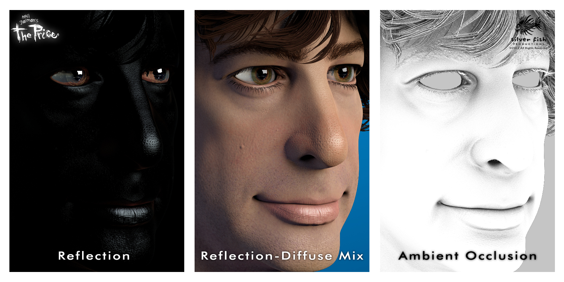
Next, we need something to make the eyes look wet and glossy and the skin to have a little shine. Looking at the Reflection pass on the left,you can see all of those highlights against the black, which are again blended with the Diffuse pass in the center image. You have to balance/adjust each area to achieve the look you want (for example, too much on the skin will make it look oily — ick). On the right is what is called the Ambient Occlusion pass, which generates the dark areas on a surface that are created when light is being blocked by the structure and features of that surface. Different than just cast shadows, this image really helps to define the shape of things and makes the lighting look much more realistic.
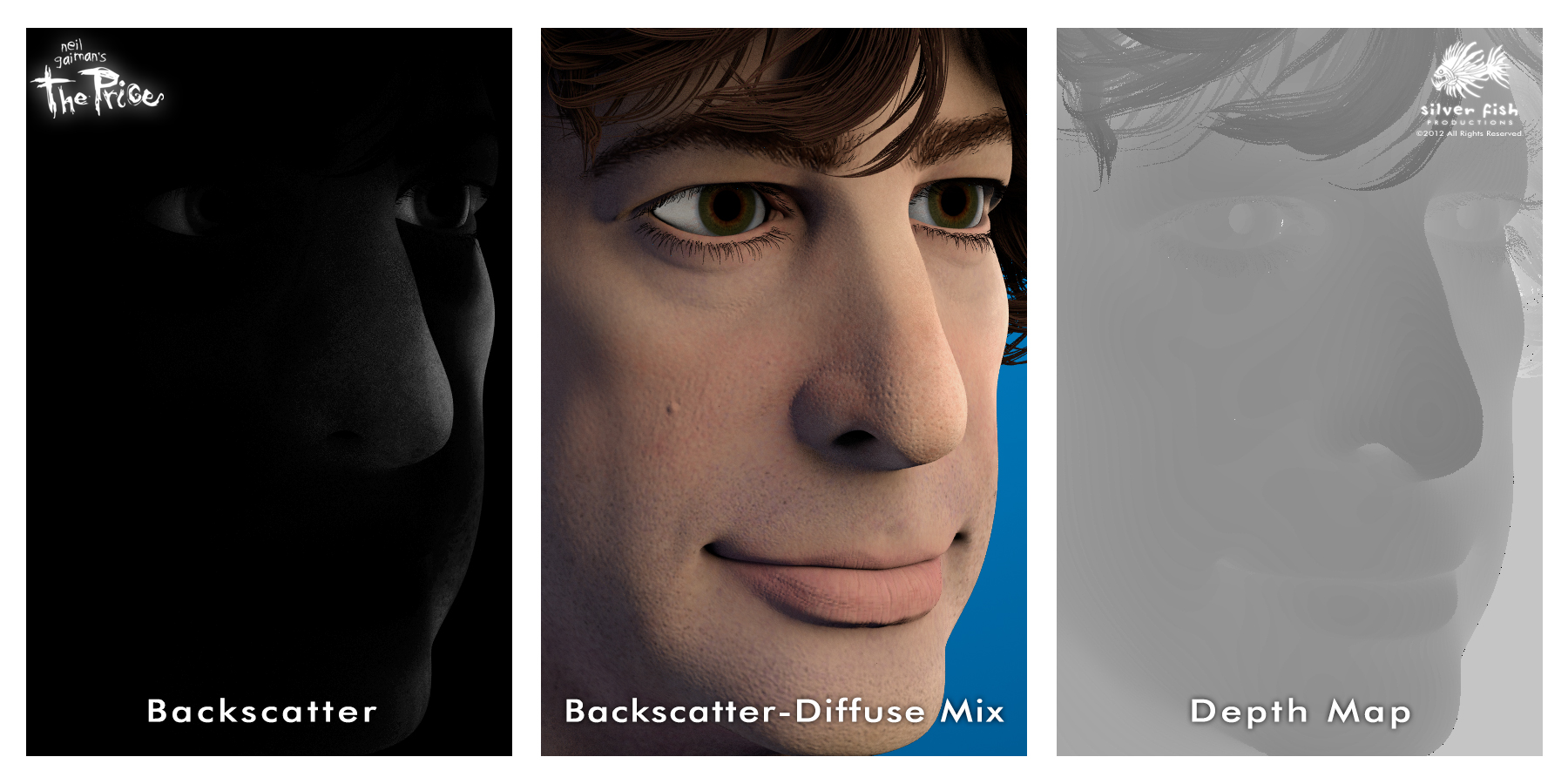 We’re not finished yet; the Backscatter pass simulates the way light bleeds through the edge of a translucent object, like, say a nose or cheek. Looking at the mixed image above, you can see how the Backscatter helps define those areas and makes them seem more “fleshy.” The Depth map is a way of telling the computer how far away different areas of the model are from the camera. The way this pass is set up, the darkest objects are closest. In the final composite, I can use this information to affect which parts of the face are in focus, and create a shallow depth of field effect.
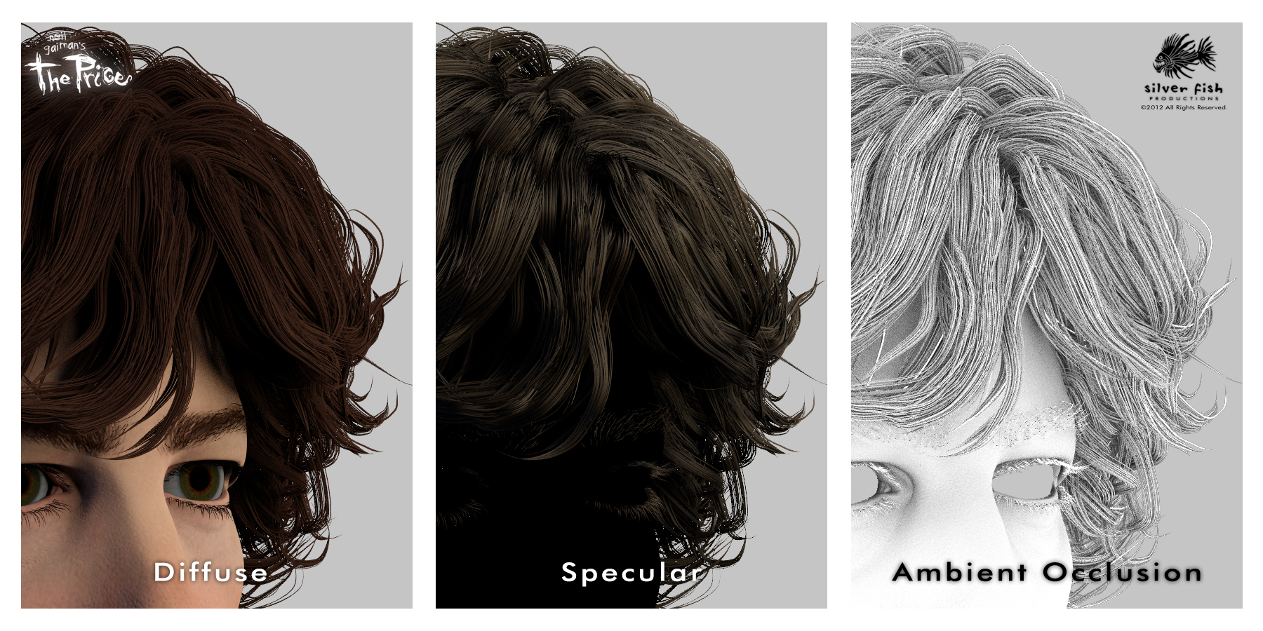 Finally, that famous mane of his. The Diffuse again provides the base image, while the Specular gives me control over the highlights and glossiness, and the Ambient Occlusion defines the shadows and the shapes.
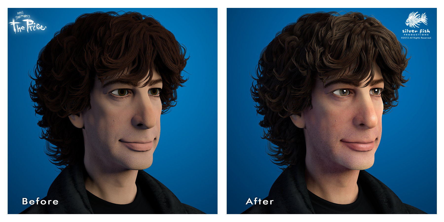 Now, one could easily ask if all of that is really necessary. My answer would be to compare the Before and After images, and see what you think; I much prefer the After!
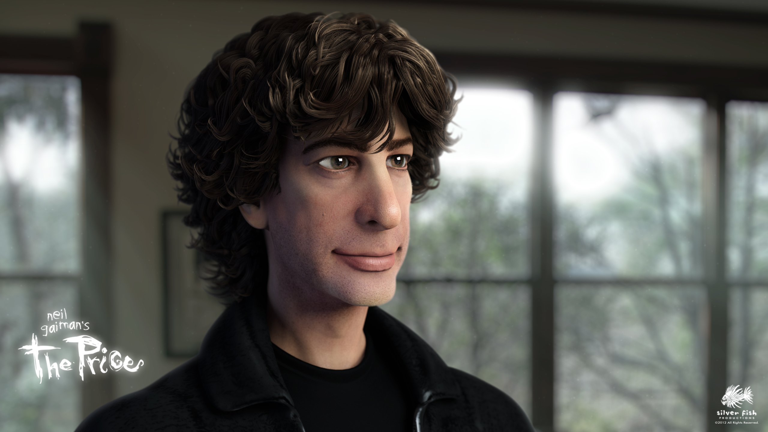
Once all of these passes are ready, I add a background and then dig deep into my bag of compositing tricks… and you wind up with the image below (which you are welcome to download if you are so inclined).
Again, it is my sincere hope that this post will provide you with some insight and appreciation for the work involved in creating the images I have been dreaming about for so very long; above all, I want to give you a tantalizing taste of things to come!!! 




I thought, well, the before looks pretty good, but the after, well… it IS Neil. How incredibly amazing. Well done fine sirs! Bravo!
That IS so very kind of you, Jill! And that is exactly the response I was hoping for!
Fantastic attention to detail. Very cool. Thanks for the behind the scenes look.
Thanks Andrew; as they say, the devil is in the details, right? (That makes more sense if you’ve read the story.)
Hehe, I see what you did thar
Hey there, Smarty-Pants!!!
I keep looking at the finished product and expect him to turn and start talking. I’m pretty sure that’s what you were after, so, keep up the excellent work!
Thanks Genevieve; that’s coming next…
The finished image has so much life! It is more than worth the wait.
Keep up the good work!
Thank you Pat! It is difficult to get the finished model to look believable, but not “creepy” as in “Uncanny Valley” creepy (where something looks “wrong” and becomes off-putting to the viewer).
I think that it’s actually a great stylistic call to be close to photoreal, but a little stylized so you don’t have to deal with the stringent “uncanny valley” standard. From a psychology-in-filmmaking perspective, it’s a very savvy decision.
Very true. You want “Mr. Neil” to come to life, yet not be some creepy simulation of the actual person.
The hard work will be well worth the end project. For people like me, who are not artistic at all, the amount of techical work that you and your team go through to bring this dream alive is inspiring. I hope that you will never dispair and, since you are officially almost as cool as Neil for having met him, stay the happy over excited guy you were in the video/photo post about getting to meet him. It truely is an experience to be able to live a dream through someone else. Thank you for the oppotunity.
That is very kind of you to say, Dahlia. Despite the bumps in the road, I can’t help but stay excited and even feel a little shocked at my amazing good fortune!
You guys are wizards!
Why thank you, my good man! (I am starting to show quite a bit of grey in my beard, after all!)
Flattering indeed…love it..
Thanks John; it can’t hurt, am I right?
Seeing this I just know the final product will be amazing. Great job!
That’s most definitely the goal, Susan — thanks for your enthusiasm!
So much hard work! Who knew it was that complicated (although we suspected it was the case).
That is more true than you know, Nathalie — even for me!
Endless patience here for your great project. Or so I thought. This post made me lustfully want to see the finished piece! It is going to be gorgeous!
Watching and hearing your process has been a great experience. . . so worth my small hopeful contribution.
Exciting and wonderful. Keep up the great work!
I can’t wait to see the finished film either, believe me, so thanks for the kind words Kathy!
Amazing final picture. Definitely not in the Uncanny Valley. Do you have to do all this layering for every frame (24fps) or is automated once all the layers have been defined? How long does it take to generate each image?
Thanks Peter! I am not creating traditional animation (generating 24 individual frames per second of finished film), but using multiple renderings for poses and images that will be animated using a variety of 2D & 3D techniques. It’s a hybrid technique that I am creating to give the general impression of animation without having to render each frame — more like a moving illustration. I’m sorry not to be more clear, but once I have some examples, I’ll create a specific update that will do a much better job of explaining the process.
Those passes you asked about can be automatically combined, but I prefer to maintain control over each element and composite them myself (although the rendering/compositing will be partially automated). As far as computer time per pass, that is dependent on several factors that will change for each scene and for the specific requirements of what is being rendered; generally, each can take several minutes to several hours to complete.
As one who has dabbled around with 3d digital art (mainly using the wonderfully free Daz Studio and Bryce 3d)
I am in awe of your work! I think the final film is going to be something special
Thanks Robin — I’m sure you have a special understanding for what we’re trying to do. I appreciate your vote of confidence!
This is beautiful! A tiny Neil coming to life—i want one for my desk, so Boss can be consulted at all times…
can’t wait to catch up, this is a fantastic update. Many thanks, @Xtopher!
Well, if that’s what you want, I guess we’ve gotta look into making that wish come true
Heh-heh… we just might be able to arrange such a thing…
amazing. wonderful. the background looks very good as well.
and how odd that a computer can do all that but not figure out a captcha code.
No doubt, my friend! And I’m sure you recognize that background…
I actually thought about this project last night and wanted to come check on the progress, so thanks for the conveniently-timed update! It looks absolutely amazing. I know you’re trying to do the story and Neil justice, but you’ve gone above and beyond. Well done, and I’m even more excited (if that’s possible) to see the finished project. Excellent work!
Much thanks for those kind words Kat! It isn’t just the man and his work I’m trying to honor; I want to be true to the images and ideas in my mind as well. This has been such an incredible opportunity for me to be able to reach down deep and do my very best work, and for that, I will always be grateful.
Wow! The layers are fascinating. The individual layer images make Neil look amazingly creepy. But the finished product is amazingly NEIL! Kudos my good man!!
I know, they do look a bit spooky, but that’s kind of fitting, don’t you think? Gracias, my good woman!
Absolutely fascinating, and the level of detail in the finished “After” image is incredible. The film is going to look friggin AMAZING! Keep up the awesome work, Chris!
Will do, Trina! Thanks for your enthusiasm!
Fantastic work as always! Thanks for the updates and insights and inspiration. This helps me keep my own little project going….
Thanks Tim, and glad to hear it helps a bit — keep the faith, brutha!
Love to see this, thanks for the exceptionally detailed commentary. I’ve been around technology my whole life, especially having been so involved in games and games journalism as a younger man, but there’s still a lot that slips by me or that I don’t understand properly. Very cool to get a detailed description about what goes into this part of the process.
And the work really does look fantastic. I absolutely love the slightly caricatured look that’s so lifelike. It’s just perfect. It looks almost exactly like Neil and yet not quite, and that works so well. I suppose it also gives you the cushion of avoiding pure realism, since that can never quite be achieved, but you’ve captured his likeness so well that you forget the slight exaggerations.
Still so very much looking forward to meeting you guys at the end of all this. I’m starting school again after a 12-year hiatus, so hoping that won’t interfere with my chance to be at the premiere!
Hey my friend — so great to hear from you again! Glad you dig the stylization; can’t wait to meet you either! And congrats on the schooling adventure too! Best of luck!!!
Wow, amazing! I love reading these updates, it really makes you aware how much hard work goes into an animated film. And Neil looks like he’s alive and about to start talking – in a good way.
I’m sure the finished product will be great – I know I can’t wait to see it.
I am amazed that you (and apparently many others) continue to read along, even on these more “technical” diatribes! Thanks for saying you enjoy them, Penny!
Wowza. Looks great, sir. Keep up the good work! Eagerly awaiting the final product! (And by the looks of it, it’ll DEFINITELY be worth the wait)
Thank you, kind sir!
Each time you send an update on your progress I get more and more excited about how wonderful the finished product is going to be. I’m glad you’re taking the time to pay attention to the details that will make this a superior film we will all be proud to have supported!
Keep up the good work – I’ll remain (sort of) patiently waiting!
Suzi
I am so glad you do, Suzi, and I truly appreciate your patience and understanding as we endeavor to get this right!
This is an amazing work!! Thank you for sharing this …. it gives a new prospective to what you do!! I am looking forward to the final product…….
You are so very welcome, Alfredo!
Late to the party again! Nothing really much to say except for the fact that I admire the amount of attention to detail you guys put into it. There are so many things involved in making CGI models believable, even when you’ve decided to stylize your art in a (as I mentioned before) very savvy decision to avoid straight photorealism, which I presume is a maneuver to avoid the full-on uncanny valley effect. Even so, the finals look fantastic and go a long way towards making me forget that they are CGI models, and making me believe that they are characters. I suppose all this comes with experience, but I can’t fathom having to think of something as minute as “the backscatter translucency does not look quite right…gonna have to tweak those algorithms again.” My admiration to you, sir.
Again, can’t wait to see the finished film, but happy to give you as much time as you need to do it right
You make it sound a lot more intellectual than it really is, my friend! But I will readily admit to being thrilled with the results thus far, and can’t wait to get this guy into a motion test for everyone to see!
from what all i have seen this looks like its going to be as magical as coraline, woot @_@
That is high praise indeed, my good man! I’m excited to see what Henry Selick, the director of Coraline is up to next!
Your finished graphic is indeed better and the detail is mind blowing – Can’t wait to see the final product
Thanks Charisse … plugging away and trying to keep up with (and hopefully exceed) expectations! Thanks for following along!
Pingback: MDU115: 3D Production Pipeline – Lighting, Rendering and Compositing – PlatypusHero